Light that contains all visible Wavelengths is called white light. When white light passes through a solid geometric shape, all the visible spectrum is projected on the surface. When light hits a surface, a combination of wavelengths that are not absorbed are reflected back to our eyes. Our eyes report, to the brain, signals of these wavelengths. The wavelengths go through a digestion process and the adjusted and combined signals are reported to the brain.
R + G + B
Our eyes respond to light through 2 main stages. At first the eye receptors receive the wavelengths and second our visual system interprets and modifies these signals before sending the message to the brain. This modification process is responsible for our unique and at times strange perception of color.
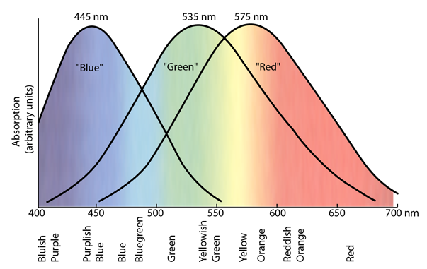
There are 3 types of cone receptors. These receptors have different sensitivities to light and while each of them responds, to some extent, to different wavelengths, the intensity of response at different wavelengths is the start of color perception process. To simplify, let’s call these 3 receptors R, G and B. R (Red) represents the response to long wavelengths, G (Green) to middle wavelengths and B (Blue) to short wavelengths of 4000 nm to around 500 nm. When our eyes receive light, the visual system reads the wavelengths in combinations of R, G, B values: R-G, R+G and Y-B.

With R-G, color is interpreted as either too much red or too much green depending on individual values of R and G. Simultaneously, the value of R is combined with the value of G and this combination is R+G, which signals the yellow value (Y). So we have Red, Green and Yellow. Depending on the level of illumination, our visual system prioritizes one of these combinations over the others. For example if R+G value is below a certain level, our perception mostly takes notes from Y-B channel, leading to more dark yellow and dark yellow-red (orange) colors or known as olive green and orange brown.
light & color constancy
Our brain encoding process works with our visual system to identify, recognize and understand the world around us. In order for us to recognize an object under different lighting, we need flexibility and the ability to adjust.
Light, our visual system and brain work together to identify colors and other characteristics of an object within our visual field. As time of day changes, our perception of colors changes too. While we unconsciously take notes of these changes, we compare any new information we have received with previously registered events and objects (the hippo in our brain). We often disregard the change in colors in favor of creating familiarity and stability of our surroundings- something our brain loves to do. This desire for familiarity, stability and manipulation of information received is the reason why we can identify an object over and over again even when some of its characteristics have changed including its color(s). For example, when we see an incomplete circle, we can still recognize that as a circle even though we don’t have all the information of a circle. When we see a tree in the morning and then again at night, we can still recognize and identify the object as tree. This is our basic human survival mechanism. Learn more about how our brain recalls and shapes memories in our previous article- Here.


Our visual system also works in favor of keeping the appearance of color reasonably constant even as light changes, an effect called “Color Constancy”. Our visual system works to some extent to ignore the change in light and color relationship for reasons we explained above. Abstract artists and Impressionists often use this effect to their favor to communicate without using all the characteristics of an object- just enough to trigger our brain encoding process (Hippocampus).
simultaneous contrast: one color as different colors
Colors are perceived in relationships with one another and their surroundings. The primary job of our visual system is not to detect isolated colors but to recognize individual objects and separate them as clearly as possible from the background and the surrounding objects. Our visual system is constantly making sense of our surroundings. One of the interesting effects of color relationships is Simultaneous Contrast which happens when a color is contrasted with another color. To distinguish the colors from one another, our vision heightens or exaggerates the differences between the colors which results in adjustments to intensity, hue, chroma and even size of each color. If the two colors, contrasted against each other, have the same color dimensions (exact same color) then our eyes only see one object in one color and shape. However, we experience Simultaneous Effect when two or more colors have different color dimensions.

Size and shape play a big part in Simultaneous Contrast. When an object is placed in our vision arena, the more it fills our visual field, the less our visual system interacts with the surrounding colors. The color that fills most of our visual field appears bolder and stronger than if we see the same color on a smaller surface.
On the contrary, if we place a small red object in front of a larger background of the same hue but a different value and intensity, then our visual system tries to distinguish between the colors by making most of the adjustments to the color of the object- the smaller item compared to the background.
The background color and intensity can also influence our perception. It can either give attention to the object placed against it or blur the lines between the background and the object to diminish its appearance. Depending on the outcome the designer would want to achieve, the background can exaggerate or diminish the Simultaneous Effect. As the difference between the object and the background gets more noticeable, our eyes make the contrast more prominent. The visual system keeps modifying the dimensions of each color to distinguish between the two colors, which results in changes in our perception of the object’s color and even size/shape- see image on the right.
The background can make the object appear as a completely different color and this change in color can be explained with Induced Color Effect. When an object is placed against another color, our visual system heightens or subtracts the background color’s perceptual complementary color from the object’s color. So if a blue object is placed against a blue purple wall, the complementary color of blue purple, yellow, is added to the dimensions of the object’s color, blue, which makes the object appear more blue green, a different color.
0 Comments